Baby’s first ebru experience
Okay so for this I went to the Ambacht in beeld festival.
Which I reccommend, it’s great!
The workshops are cheap and the vibes are excellent. Every year I try to drag more people into joining the fun.
And there’s an ebru workshop (that’s the Turkish marbling technique with the pretty colours) so that’s an obvious yes on the workshop list.
And long story short it’s fun!
I get to make some patterns and play around with combs and learn how to lay my paper down and pick it up etc etc
My one gripe with the workshop itself is that the instructor keeps referring to the size as “special water” and the paints as “special paints”.
And people are asking what’s in it and he just won’t tell which annoys me on a teacher level not gonna lie.
But yes, slightly salty but still a fun experience and definitely worth the money I spent on it (€12,50 for an hour which is like, no money and I made 6 marbles (varying wildly in how much I like them)
So allow me to go and rank my own creations. Because why not!?
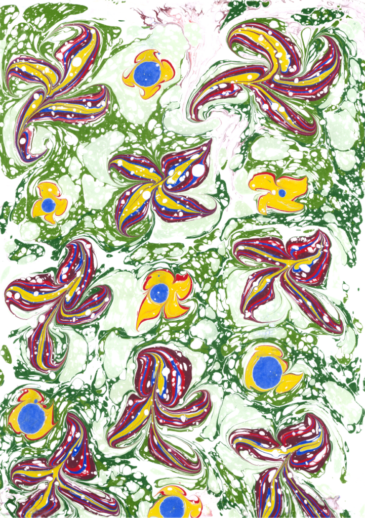
No 6. Started really cool but then I messed it up

The assignment was to make a flower or a heart design by dragging the paint out with a skewer. And I was feeling really proud about my lilies! I thought they looked pretty cool but then I added these yellow flowers as well and then oops the design was suddenly way too busy!
If I got to make this again I’d make three lillies and then try and drag stems between them. It’s be more “painting” like and less of a pattern but it would feel more balanced.
No 5. Oops not enough paint

I like the colours I like the pattern but the edges are almost entirely white because I didn’t put enough paint on the size before printing.
Easy fix however, just add more paint next time.
No 4. Actually pretty cool buuuut

We’ve arrived at the designs I can definitely use but I’m still gonna nitpick because I can.
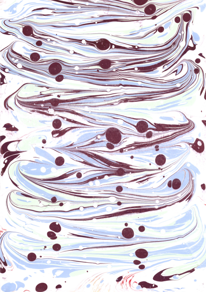
I really like the monochrome and totally didn’t steal the idea from one of the fellow workshop participants (I did but they were using green so it’s fine).
The one downside is that I didn’t clean the size well enough between prints aaaand there’s some colour leakage on the egdes. Which I’ll probably just cut off when I go to use it so it’s fine but still there’s room for improvement.
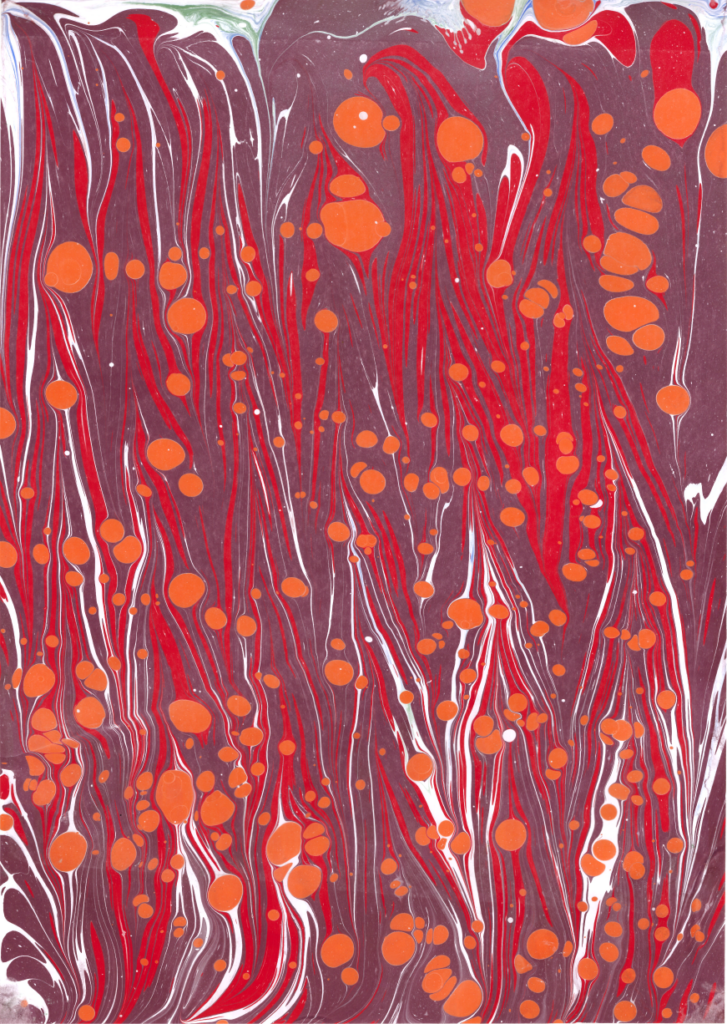
No 3. I am very surprised I love this colour scheme

I don’t like orange generally, especially not the bright neon orange that harkens back to football and kingday and wasteful consumerism in the name of patriotism (yes I am Dutch, how did you guess?)
But in this design it kinda works!? The purple and red base was looking kind of flat by itself and the orange really helps focus the eye and brighten the whole thing.
No 2. Reminds me of roses

This is what I wanted the lily one at no 6 to be, a nice flowery paper that’s a bit abstract. I have no further notes, it’s just excellent.
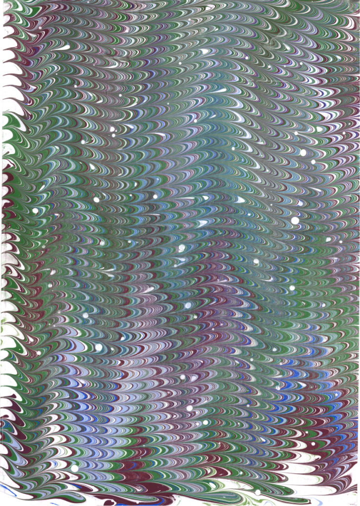
No 1. Reminds me of beetles

I am weak to purple green and blue together. It reminds me of beetles and this was what I was going for with no5. It’s almost as if I learned from my mistakes. Also I think combing is a lot of fun to do and yields neat results.
Conclusion
I had a fun day (I did like a bunch more workshops and even a masterclass I’ll probably talk about at some point in the future but for now.
I need to try and recreate this at home.